CSS and HTML
The foundation of responsive design is the combination of HTML and CSS, two languages that control the content and layout of a page in any given web browser.
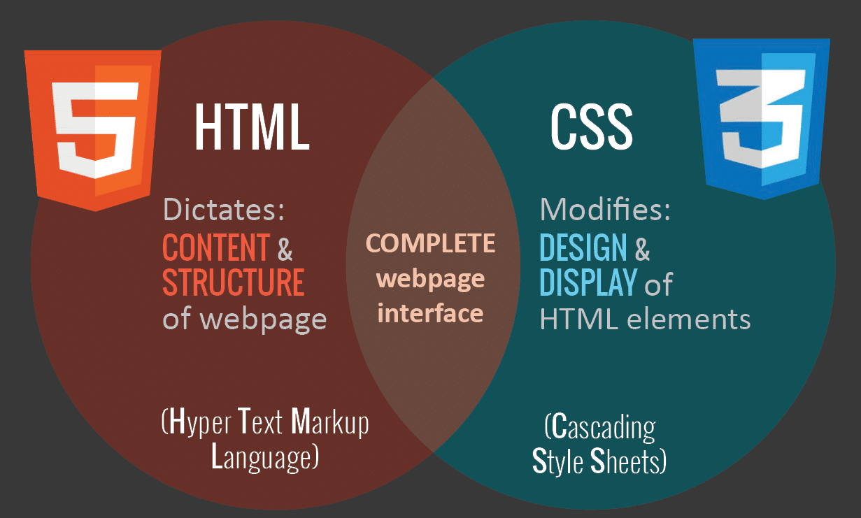
HTML mainly controls the structure, elements, and content of a webpage. For example, to add an image to a website, you have to use HTML code like this:
[
<img src="image.gif" alt="image" class=”full-width-img”>]
You can set a “class” or “id” that you can later target with CSS code.
You could also control primary attributes such as height and width within your HTML, but this is no longer considered best practice.
Instead, CSS is used to edit the design and layout of the elements you include on a page with HTML. CSS code can be included in a <style> section of a HTML document, or as a separate stylesheet file.
For example, we could edit the width of all HTML images at the element level like this:
img {
width: 100%;
}
Or we could target the specific class “full-width-img” by adding a period in front.
.full-width-img {
width: 100%;
}
You can also control the design beyond just height, width, and color. Using CSS like this is how you make a design responsive when you combine it with a technique called media query.

