Media Queries
A media query is a fundamental part of CSS3 that lets you render content to adapt to different factors like screen size or resolution.
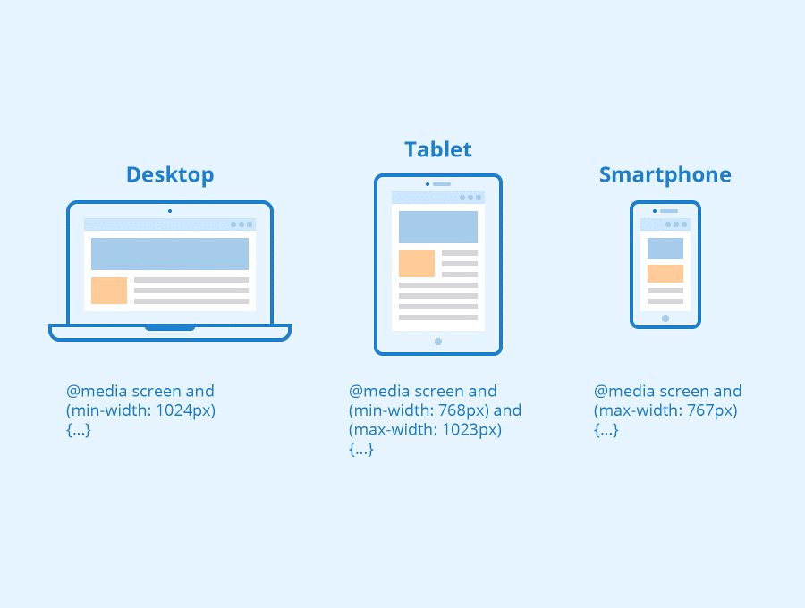
It works in a similar way to an “if clause” in some programming languages, basically checking if a screen’s viewport is wide enough or too wide before executing the appropriate code.
@media screen and (min-width: 780px) {
.full-width-img {
margin: auto;
width: 90%;
}
If the screen is at least 780 pixels wide, “full-width-img” class images will take up 90% of the screen and be automatically centered by equally wide margins.

